Bar plot of single gene expression (Delta Delta Ct method)
Source:R/plotSingleGene.R
plotSingleGene.RdCreates a bar plot of relative gene expression (fold change) values from single gene analysis
Usage
plotSingleGene(
  res,
  col_width = 0.8,
  err_width = 0.15,
  color = "black",
  alpha = 1,
  base_size = 12,
  d = 0.4,
  ...
)
Arguments
- res
An object created by the
ANOVA_DDCt()function- col_width
Numeric. Width of bars (default
0.8)- err_width
Numeric. Width of error bars (default
0.15)- color
Optional color for the bar outline
- alpha
Numeric. Transparency of bars (default
1)- base_size
Numeric. Base font size for theme (default
12)- d
Distance between horizontal significance lines
- ...
Additional ggplot2 layer arguments
Examples
res <- ANOVA_DDCt(
data_2factor,
numOfFactors = 2,
specs = "Drought",
numberOfrefGenes = 1,
block = NULL,
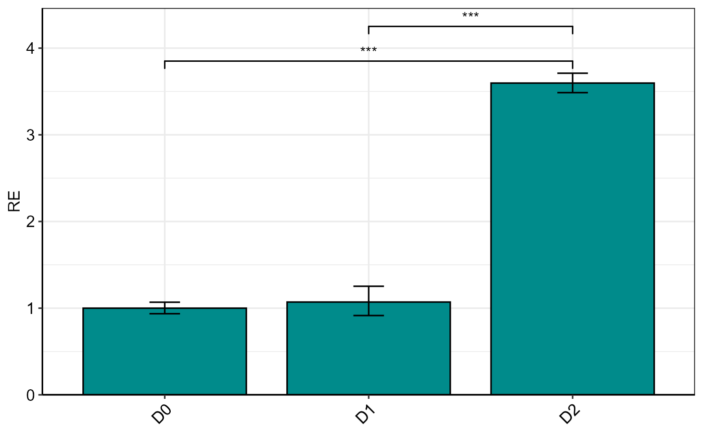
analyseAllTarget = TRUE) # If you have multi-target gene data, specify a single target gene.
#>
#> Relative Expression
#> gene contrast ddCt RE LCL UCL log2FC se Lower.se.RE
#> 1 PO D0 0.00000 1.00000 0.00000 0.00000 0.00000 0.09564 0.93586
#> 2 PO D1 vs D0 -0.09833 1.07054 0.75825 1.51143 -0.09833 0.22675 0.91483
#> 3 PO D2 vs D0 -1.84667 3.59668 2.54751 5.07795 -1.84667 0.04497 3.48630
#> Upper.se.RE Lower.se.log2FC Upper.se.log2FC p.value sig
#> 1 1.06854 -0.09564 0.09564 1.0000
#> 2 1.25274 -0.12842 0.32508 0.6744
#> 3 3.71056 1.80170 1.89164 0.0000 ***
#>
#> The D0 level was used as calibrator.
#> Note: Using default model for statistical analysis: wDCt ~ Drought * Genotype
plotSingleGene(res, fill = "cyan4", color = "black", base_size = 12)